6 PowerBI Dashboard
As an owner or skipper of a fishing vessel, you have access to various sources of information that will help you manage your work. The standard onboard equipment tracks location, monitors fishing activities, measures fuel consumption and records landed catches. Although this equipment collects valuable data, it is only useful if the data is processed into interpretable results.
That’s why the data is automatically gathered and integrated with economic parameters such as fish and fuel prices. This results in a business intelligence tool for the owner, called VISTools Analytics.
This manual provides a step-by-step guide on how to use VISTools Analytics, from logging in to interpreting the results. The original data is secured, so you can freely experiment with the application without the risk of making mistakes.
Log in to VISTools Analytics
Step 1: Go to the website
Navigate to www.vistools.be.
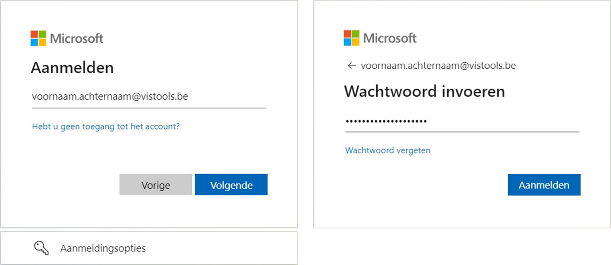
Step 2: Log in
The following window will appear for login. Enter your VISTools email address and password. The email address is usually in the format: firstname.lastname@vistools.be.
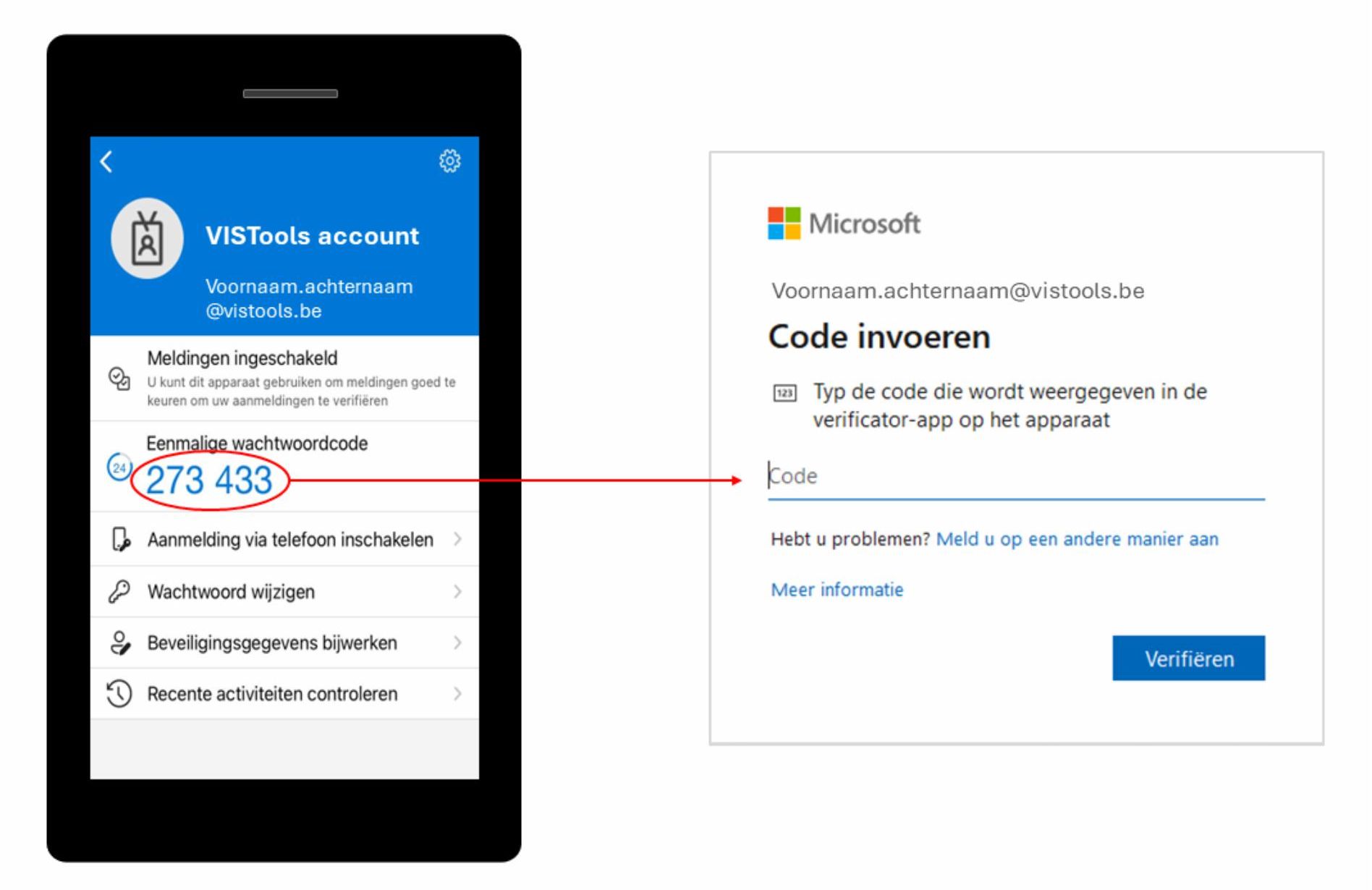
Step 3: Confirm with the authenticator app
Sometimes, you may be asked to confirm your login using an authenticator app. Open the authenticator app on your smartphone that is linked to your VISTools account (such as the Microsoft Authenticator app). Enter the one-time password code displayed in the app (see Figure 3).
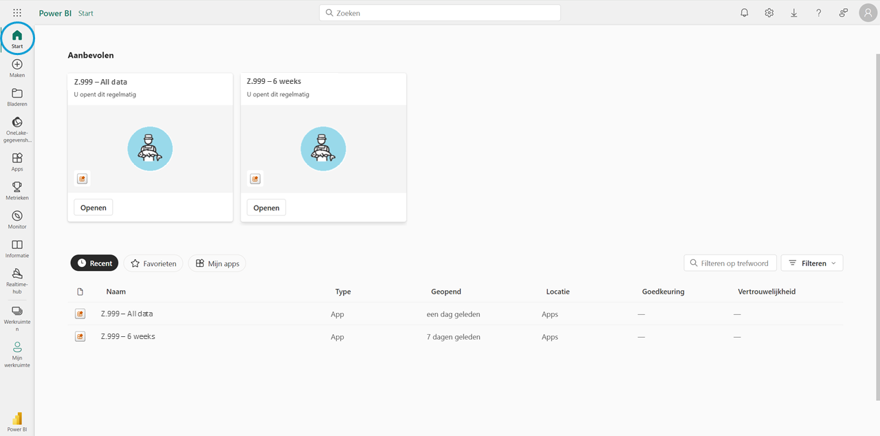
VISTools analytics dashboard
After logging in, you will see the following screen.
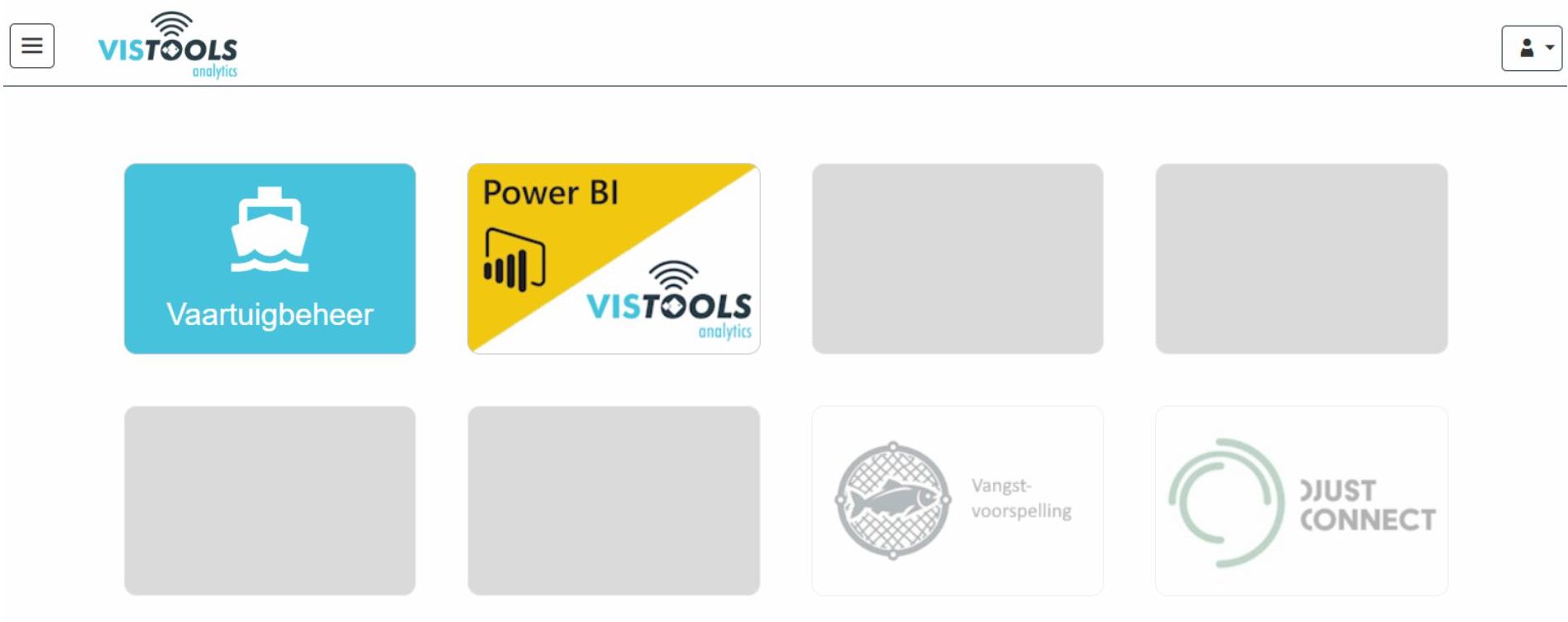
The home screen contains two important buttons: Vaartuigbeheer (Vessel Management) and Power BI. In Vessel Management, you can view trips and their associated catches, as well as modify trip details such as the fishing gear used and the current fuel price. Power BI provides a visual overview of key metrics, including revenue, catch sizes, and fuel costs, down to the level of individual hauls.
At the time of writing (December 2024), the Vangstvoorspelling (Catch Prediction) and Djustconnect buttons are not yet active. The Catch Prediction button may be activated later if the vessel owner decides to share catch data for research into developing a catch prediction model for the vessel.
In the next section, we will focus on the Power BI functionality of the VISTools Analytics Dashboard.
Power BI
Opening the Power BI App
After clicking the Power BI button from the VISTools Analytics home screen (Figure 4), you will need to log in again. You will then be directed to the Start tab of the Power BI application (see Figure 5, top screen).
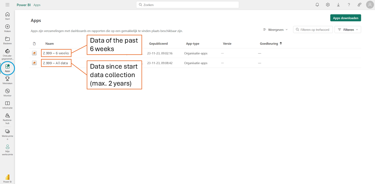
If you have recently opened Power BI, you should see one or both of your vessel’s apps here. If they do not appear, click Apps in the left-hand menu (see Figure 5, bottom screen).
Each vessel linked to your account has two apps:
6 weeks: Provides visualizations of all trips from the past six weeks. Always use this app when analyzing recent trips, as it is much faster than the all data app.
All data: Displays visualizations of all trips since the beginning of data collection, limited to a maximum of 100 weeks. Use this app only if you need to look back further than six weeks.
This manual explains all features using the 6 weeks app. The All data app functions in the same way, with the only difference being that it allows you to view a longer time period in each chart.
Refreshing Data
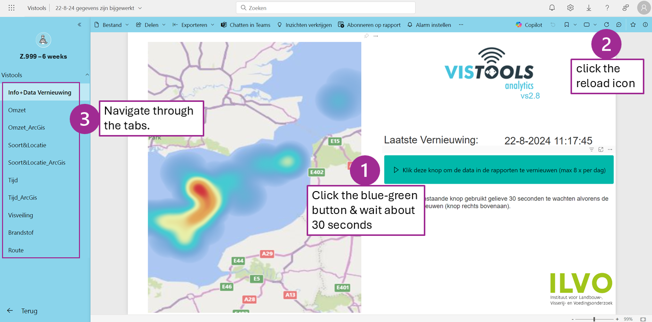
Figure 6 shows how to refresh the data to view the most recent information. The available data includes all updates up to ten minutes before the refresh.
To refresh the data:
Click the blue-green button & wait about 30 seconds
Then click the reload icon. If the reload icon is not visible, scroll the horizontal gray bar at the top to locate it.
The refresh is successful when the timestamp next to Laatste Vernieuwing (Last Refresh) updates. Note that this time is displayed in UTC.
Power BI Content
On the left side of the screen, you will see different tabs (see Figure 6, step 3). These tabs are discussed in the following sections.
At the top of each tab, you can apply filters (see Figure 7). Keep in mind that any filter applied in one tab will automatically apply to all other tabs.

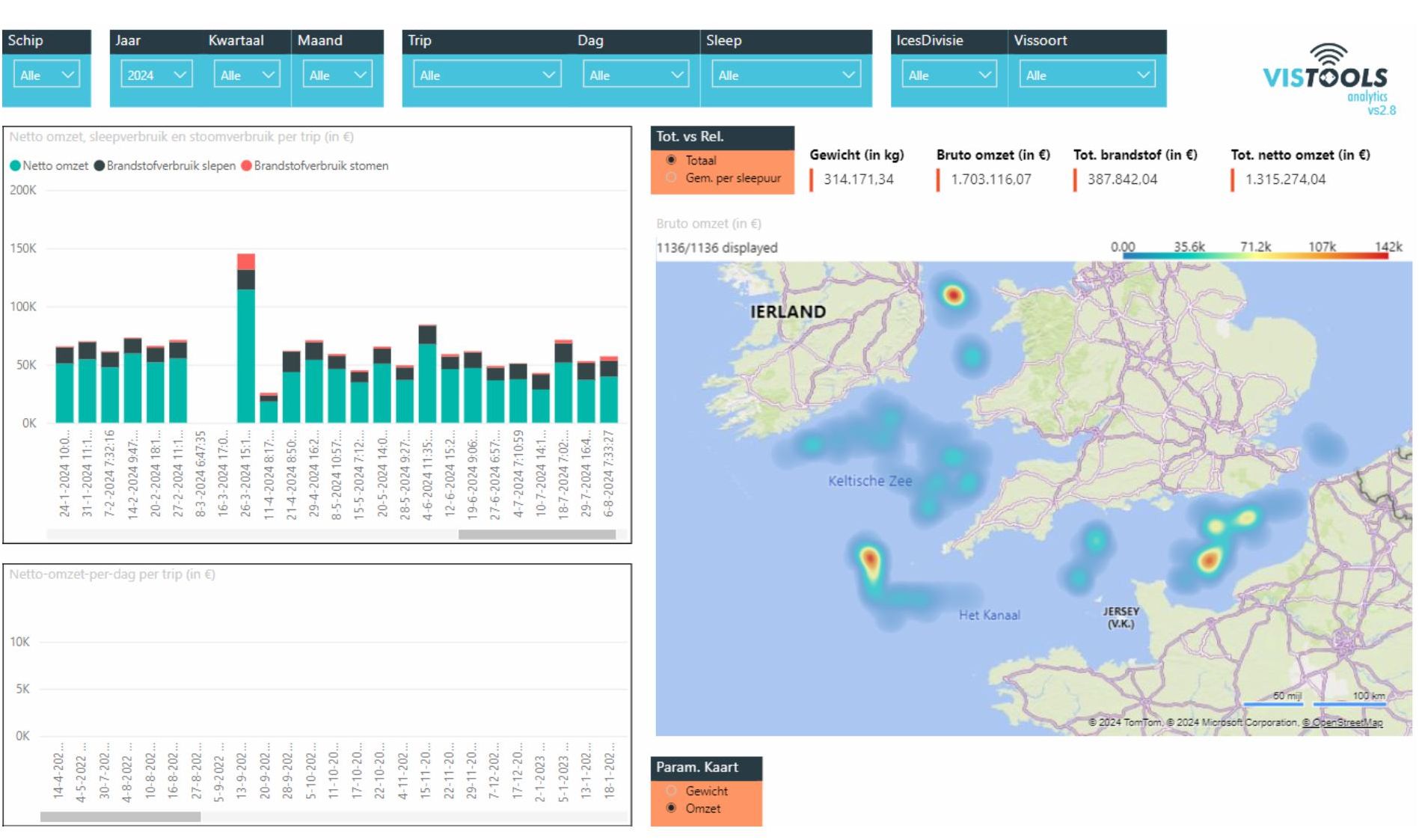
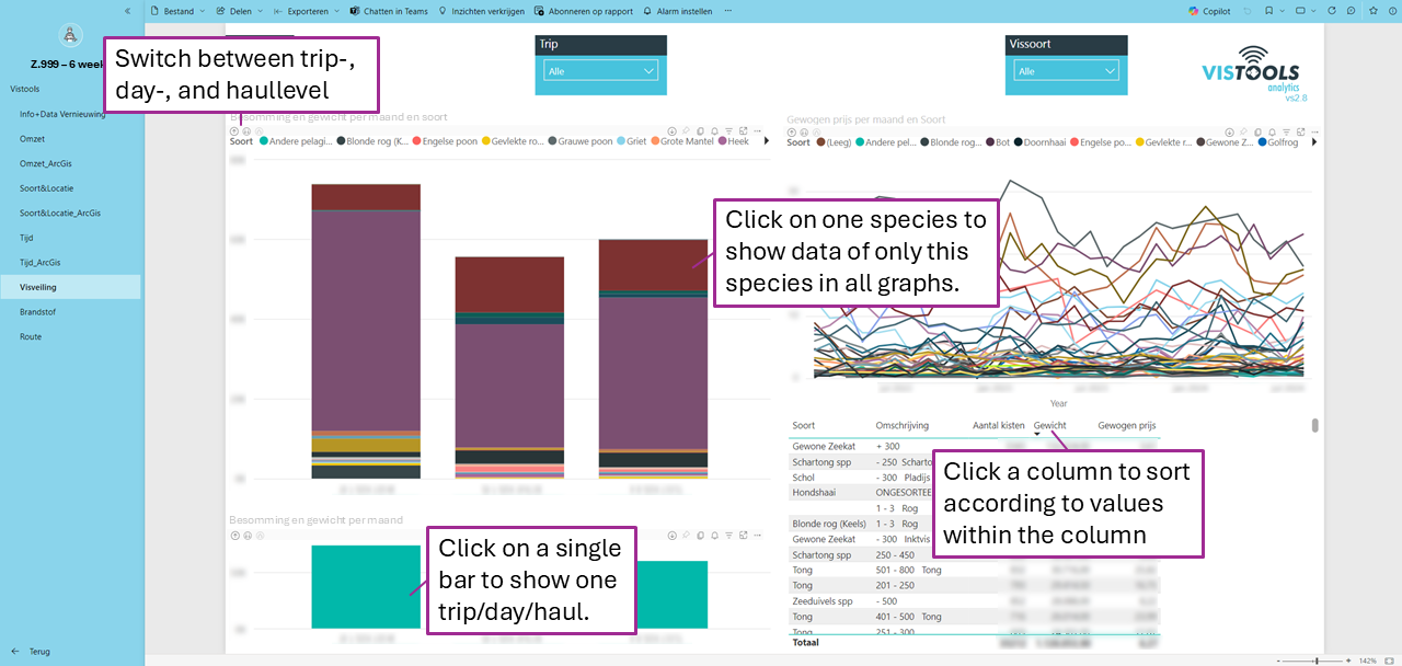
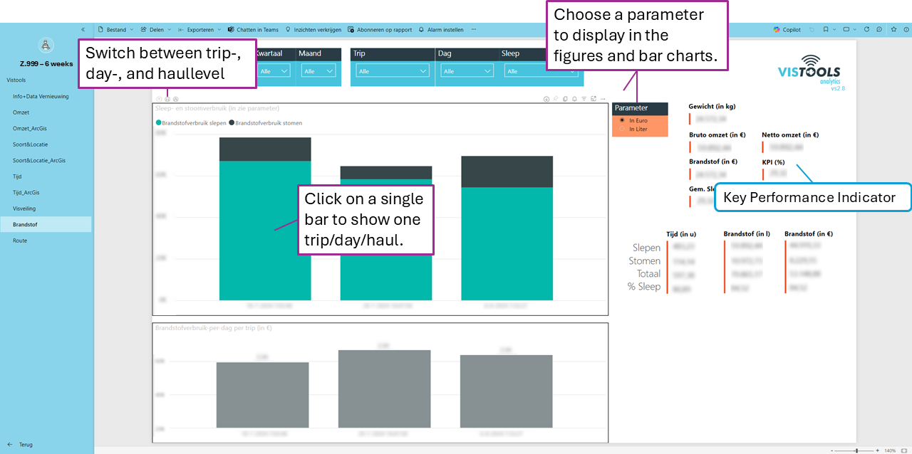
Power BI is an interactive tool. To illustrate this, the available functions in the Omzet (Revenue) tab are shown in Figure 8. The precision of bar charts can be adjusted using the icons in the top-left corner of the chart ( ). Clicking the downward arrows will display data on a more detailed hierarchical level (for instance at haul level). Clicking the upward arrow will show the graph on a higher hierarchical level. If an icon turns light gray, you can no longer go a level down or up. This allows you to analyze revenue at different levels, that is, as trip, day, and haul levels.
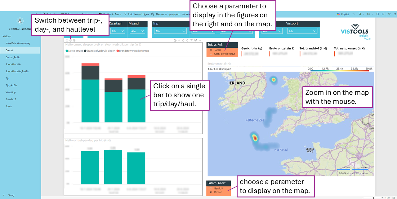
By clicking on one of the trips, days, or hauls in the bar chart, the map will adjust accordingly and display only the data for the selected period. You can undo this selection by clicking on the bar again. Additionally, the orange filters allow you to choose a different parameter to display on the maps, charts, and figures.
Omzet and Omzet_ArcGis
In this tab (Figure 8), you get an overview of the revenue per trip (or at a more detailed level depending on your selection). The map shows where the highest revenue was generated. The gross revenue is calculated by multiplying the catch weights with the fish prices from vessel management (?). When the fuel consumption is subtracted from the gross revenue, it results in the so-called net revenue. Please note that other costs, such as crew expenses, are not included in these calculations.
Soort&Locatie and Soort&Locatie_ArcGis
In this tab, you can view the gross yield and the catch weights per species. The map indicates the fishing grounds where the largest catches occurred (per species if you select a specific one). You can navigate through this tab using the same method described in Figure 8.
Tijd and Tijd_ArcGis
This tab displays the gross revenue and weights broken down by day or hour, allowing you to see the times of day when the most fish were caught. The bar charts offer the option to switch between a monthly view or an hourly view by clicking the arrows above the graphs (). You can navigate through this tab using the same method described in Figure 8. Also here, the map will adjust to reflect the applied selection in filters and bar charts.
Visveiling (Fish Auction)
In this tab, you will find an overview of all catches auctioned at the Flemish Fish Auction (displayed by species). The line chart shows the evolution of fish prices over time. The table indicates for each species and category the number of crates auctioned, the total auctioned weight (in kg), and the average auction price (in euros) considering all crates.
Brandstof (Fuel)
This tab contains comprehensive information about fuel consumption, such as consumption during towing and steaming, average consumption per day on a trip, and average towing speed. You can select the level (trip, day or haul) at which you want to view the graphs (Figure 10).
A key parameter is the KPI (Key Performance Indicator) which shows what percentage of the total earnings was spent on fuel costs. You can choose to display the results in liters or euros by selecting the desired unit in the orange box. For an accurate result in euros, it is essential that the fuel price is correctly set under Vaartuigbeheer (Vessel Management) of the VisTools Analytics Dashboard.
Route
This tab displays the routes taken by the vessel. On the left side of the screen, you can filter by trip, day, haul, or even hour. Small arrows on the route line indicate the direction of travel.